Focus Medial Journal is an annual academic journal where undergraduate students submit their research papers for publishing. Topics revolve around our ever-evolving digital age.
Background
This was one of my first large-scale graphic design projects and it’s what got me into working with a team. I had just finished my first design course and found this organization who was desperately in search of a graphic designer after their original one dropped out a few months before the deadline. I liked what they did and believed I could help them out, so I took on the challenge of creating a publication within a few months.
Project Duration:
March 2018 - May 2018
Role:
Graphic designer, Illustrator, & Layout Editor
Tools:
Adobe Illustrator & InDesign
Challenges:
Budgeting, visual appeal, time restraints, acquiring copy and editing
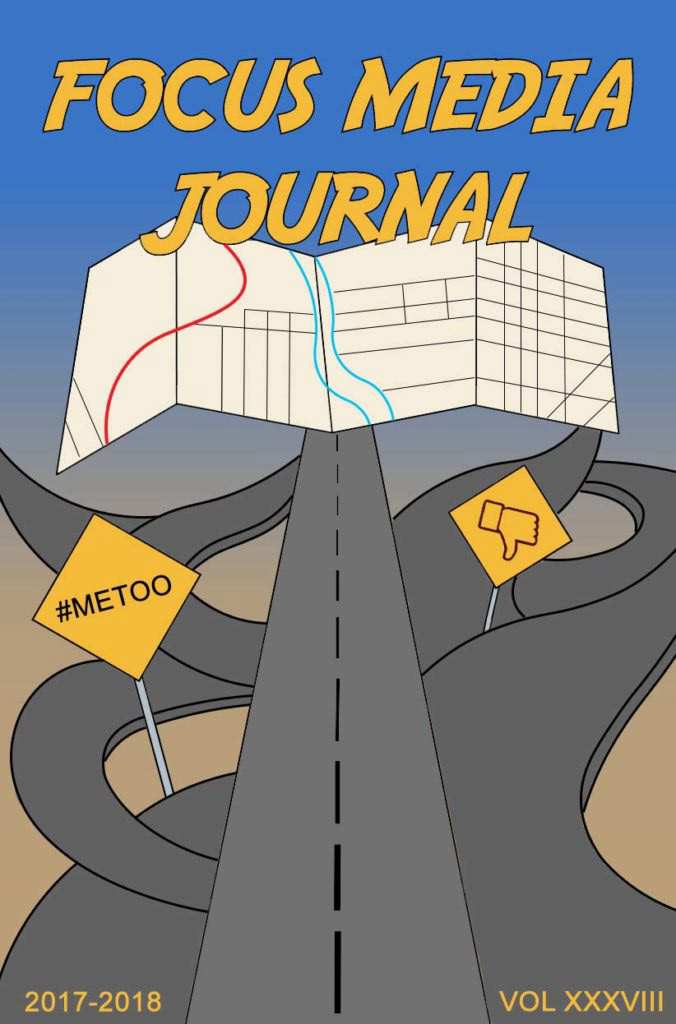
This was the concept art presented to me by the team.
Objective:
Create the cover and body of the annual journal. The theme this year was “Navigating Through Social Issues”. Keep publication within budget.
What I Did:
Designed and arranged all visual elements for this 71-page publication. Discussed and presented design ideas during weekly meetings, collaborated online through Facebook, Slack, and email, and self-taught Illustrator and InDesign.
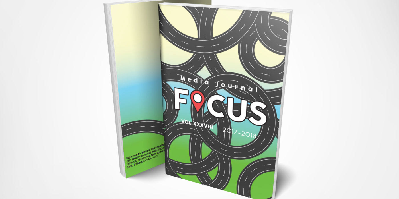
Cover Design Process:
The art coordinator wanted a book cover that had symbols of navigation and really pressed on the idea of having winding roads. After brainstorming online and drawing on paper, we digitized the design we liked most.
The first version wasn’t the best, so we decided to make another. What I saw wrong about this one were the uneven strokes, odd curves, lack of depth, and unattractive typography.
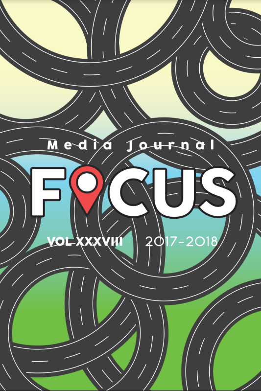
I chose to branch off from the idea of literal winding roads and turn it into a pattern. The rings are spaced evenly with some randomness to represent the idea of confusion and multiple paths. The typography was shifted so the title of the journal was central and highly visible, which was necessary to contrast the busy background. I changed the gradient to be brighter and gave it more modern typography to make the cover bolder and more attractive to passersby who see this journal.
Body Design Process
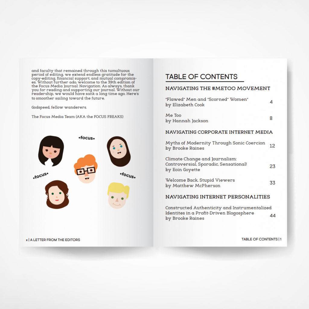
With little time to think of ideas, I looked at previous versions of Focus and based the design on those. I also wanted to improve this version in some way, so I decided to add illustrations inside the book to make it more interesting to flip through. We had a tight budget so I had to limit any extra pages or colors. In the end, my goal was to create something that reflected the fun personalities of the team, was attractive to potential readers, and clearly presented the content while staying under budget.
Looking back:
One of the biggest challenges in this project was typography. I took the opportunity to deepen my understanding of layout, kerning, tracking, font pairing, and legibility for large bodies of text. This experience strengthened my typographic skills and gave me a solid foundation in using tools like InDesign more efficiently for future projects.